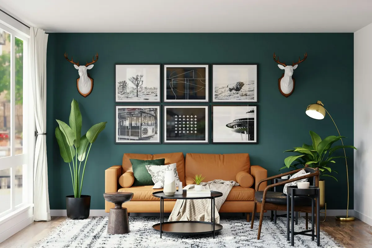
16:18A Sunday afternoon
A book lies open on the sofa. The coffee has gone cold. Outside the window, the light is beginning to soften, and an old wooden chair casts a long shadow across the floor.
You look at the room you've lived in for years.
The furniture is fine. The curtains still work. The framed photograph beside the bookshelf has been there so long you barely notice it anymore.
But something feels unfinished. Perhaps the walls have been asking for a little more personality.
And perhaps, just perhaps, the answer is green. Not the bright green of spring leaves. Not the pale green that almost disappears into a neutral palette. A deeper, quieter green. The kind that makes you look twice.
Meet Webster Green
On October 14, 2026, Benjamin Moore announced Webster Green HC-130 as its Color of the Year 2027.
The company calls it "The Quintessential Shade of Green" and describes a color that balances the stability associated with blue and the warmth associated with yellow.
Its appeal is that it can feel composed and expressive at the same time. Not exactly shy. Not demanding everyone's attention, either.
But a color being named for the coming year doesn't mean your living room needs to change its entire identity.
At ORIGIN. House Studio, we're more interested in a different question: what could this color help you discover about the home you already have?
Before the paint, the feeling
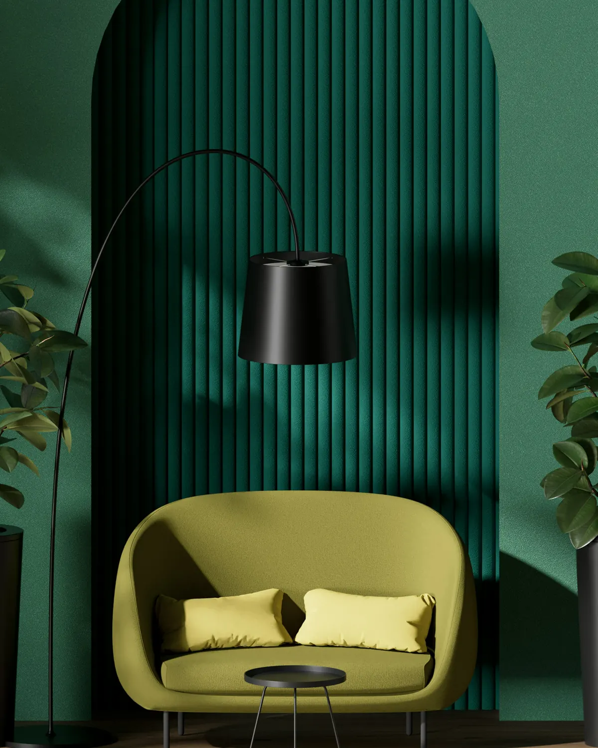
Imagine sitting in a room with deep green walls. The wooden furniture seems more noticeable against the color. A pale textile offers contrast. A lamp creates a small, warm circle of light.
Now imagine that same green appearing on just one door. The walls remain light. The furniture stays where it is. But the doorway becomes an intentional part of the composition.
Neither room is necessarily better. They simply tell different stories. One invites you into an atmosphere. The other introduces a moment of surprise.
And deciding which experience you prefer is much more useful than choosing a color because somebody called it fashionable.
Dark green always makes a room feel smaller.
A deep color may make a room feel more enclosed, but that isn't automatically a disadvantage. Its effect depends on daylight, lighting, proportions, surrounding materials and personal preference. A small room can be intimate without feeling uncomfortable.
A dark wall doesn't have to pretend it's white. Sometimes the goal isn't to create the illusion of a bigger room. It's to make the room you have feel more deliberate.
The question worth asking
Before you imagine painting an entire living room, think about the way you use it.
Do you enjoy rooms that feel enveloping, with a continuous background behind your furniture and artwork? Or do you prefer lighter surroundings with one expressive detail?
Here's a small test.
If you chose A: let the room wear the color
The first possibility is simple: give the walls a continuous green background. It can be particularly interesting in a reading corner, a bedroom or a sitting area where you enjoy a quieter atmosphere.
Instead of choosing new furniture, look at what you already own. A pale sofa might appear more distinct against green walls. Wooden shelves could gain a different presence. A framed picture might become newly noticeable.
The color provides the setting. The objects provide the story.
If you're drawn to painting walls, doors and trim in related tones, you can also explore color drenching. Benjamin Moore specifically suggests coordinated all-green schemes for Webster Green.
But make the decision after observing your actual room. A shade that feels beautiful in a photograph can behave differently beside your floor, furniture and windows. Test a physical sample and look at it throughout the day.
If you chose B: let one detail speak
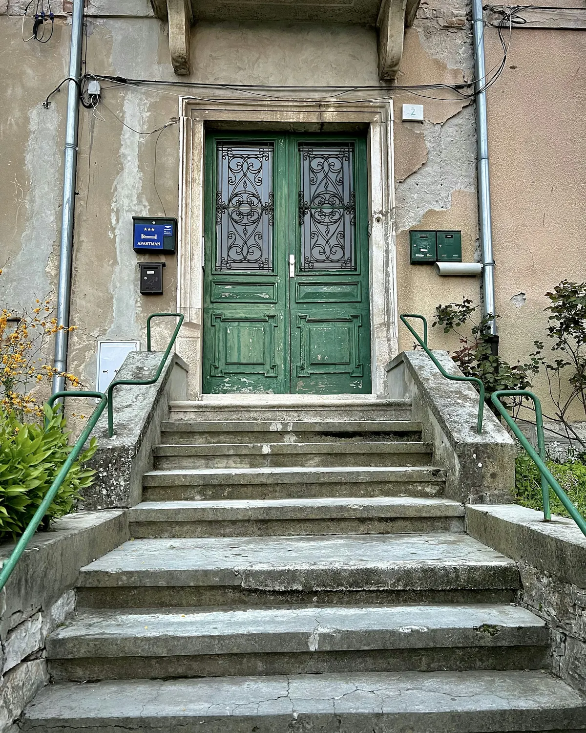
Perhaps you like your cream walls exactly as they are. That's a perfectly good starting point.
A dark green door can introduce color without changing every surface around it. So can the front of an existing cabinet, a suitable piece of trim or the back of a built-in bookshelf.
In a bookshelf, green can frame books, ceramics and photographs rather than replace them. A cream-colored bowl becomes more visible. The spines of familiar books create their own irregular pattern. Nothing has to match. The green simply gives everything a place to be noticed.
Before changing a door or cabinet, check permissions, surface preparation and whether the piece can be painted safely. And if you rent, remember that enjoying a color doesn't require applying it permanently. A green fabric, a book cover or a familiar ceramic piece might be enough.
The colors that keep green company
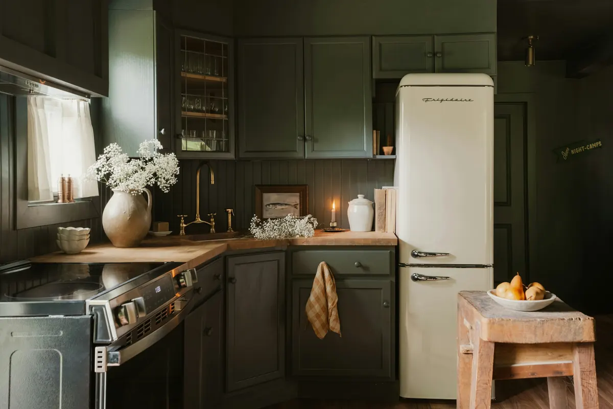
Benjamin Moore's Color Trends 2027 palette places Webster Green alongside seven named shades: White Down, Antique Copper, Shakespeare Tan, Nelson Blue, Wild Aster, Durango and Townsend Harbor Brown. The company presents them as warm, welcoming hues, pairing soft pastels with mid-tone shades.
They are the palette's official companions, not an instruction to use every shade in one room.
In your own home, the same idea can be explored with materials you already have. Cream linen beside dark wood. A faded blue book on a shelf. A burgundy textile resting against a chair.
Instead of asking whether the colors technically match, ask whether you enjoy seeing them together. And check them in the lighting you actually live with.
The one-evening green experiment
- 1Find your green
Look for something dark green already in the house: a textile, a book, a vase, a folder or a piece of clothing. If you have an official paint sample, use that to judge the exact shade.
- 2Choose a place
Try the object beside a wooden table, against a pale wall or near the furniture you're considering changing.
- 3Change the background
Move one contrasting object closer. Try cream, wood or another color you genuinely enjoy.
- 4Look after sunset
Turn on your usual lamps. Notice whether the green still feels appealing under evening light.
- 5Decide what you actually want
A stronger atmosphere? A distinctive door? A more interesting bookshelf? You may find you don't need to paint anything at all.
A home is not a color forecast
The temptation with every Color of the Year is to treat the announcement as a deadline. A new shade arrives, and suddenly our existing walls seem outdated.
But a room doesn't become less beautiful because another color has been chosen for the following year. A trend can be useful without becoming an instruction. It can remind you to reconsider a forgotten piece of furniture, to try a different combination, or to look again at a wall that has always been there.
The best color isn't the one everyone is talking about. It's the one that lets you notice your home differently.
Later that evening, the light is lower. The wooden chair is still beside the window. The photograph is still on the shelf.
Maybe you'll paint a wall green. Maybe you'll start with the door. Or maybe you'll simply bring a green object into the room and discover that it was enough.
Webster Green may be the Color of the Year 2027. But the home it inspires should still belong to you.
Sources & notes
- Benjamin Moore announced Webster Green HC-130 as its Color of the Year 2027 on October 14, 2026, describing a balance of blue and yellow and suggesting it for doors, built-ins, trim, exteriors and all-green schemes: Benjamin Moore, Color of the Year 2027.
- Independent coverage of the announcement and the Color Trends 2027 palette: Homes & Gardens, October 14, 2026.
- Photos are mood references, not exact reproductions of Webster Green HC-130. Always test a physical sample in your own light.
- Photos (Unsplash License): Elshan Neymatov, Spacejoy, James Qualtrough, Clay Banks.
16:18Una tarde de domingo
Hay un libro abierto sobre el sofá. El café se enfrió. Afuera, la luz comienza a suavizarse y una silla antigua de madera proyecta una sombra larga sobre el suelo.
Miras la habitación en la que llevas años viviendo.
Los muebles están bien. Las cortinas todavía funcionan. La fotografía junto a la biblioteca lleva tanto tiempo allí que casi has dejado de verla.
Sin embargo, sientes que falta algo. Tal vez las paredes necesitan un poco más de personalidad.
Y quizá la respuesta sea verde. No el verde brillante de las hojas nuevas. Tampoco ese verde tan pálido que casi desaparece entre los tonos neutros. Un verde más profundo y sereno. Uno que te invite a mirar dos veces.
Conoce Webster Green
El 14 de octubre de 2026, Benjamin Moore anunció Webster Green HC-130 como su Color del Año 2027.
La compañía lo presenta como el verde por excelencia y explica que equilibra la estabilidad asociada con el azul y la calidez relacionada con el amarillo.
Parte de su atractivo está en esa combinación de serenidad y carácter. No es exactamente discreto, pero tampoco necesita ser el protagonista absoluto de una habitación.
Pero que un color haya sido elegido para el próximo año no significa que tu sala necesite cambiar por completo de identidad.
En ORIGIN. House Studio nos interesa otra pregunta: ¿qué podría ayudarte a descubrir este verde sobre la casa que ya tienes?
Antes de la pintura, la sensación
Imagina que te sientas en una habitación con paredes verde oscuro. Los muebles de madera adquieren otra presencia. Una tela clara crea contraste. Una lámpara forma un pequeño círculo de luz cálida.
Ahora imagina ese mismo verde solo en una puerta. Las paredes siguen claras. Los muebles siguen en su lugar. Pero la puerta se convierte en una parte especial de la composición.
Ninguna de las dos habitaciones tiene que ser mejor. Simplemente cuentan historias distintas. Una te envuelve en una atmósfera. La otra introduce un detalle inesperado.
Y descubrir cuál prefieres es mucho más útil que elegir un color porque alguien lo declaró tendencia.
El verde oscuro siempre hace que una habitación parezca más pequeña.
Un color profundo puede crear una sensación más envolvente, pero eso no tiene por qué ser negativo. El resultado depende de la luz natural, la iluminación, las proporciones, los materiales y tus preferencias. Una habitación pequeña puede sentirse íntima sin resultar incómoda.
Una pared oscura no necesita fingir que es blanca. A veces, el objetivo no es que una habitación parezca más grande. Es darle más intención al espacio que ya tienes.
La pregunta que vale la pena hacerse
Antes de imaginar toda la sala pintada de verde, piensa en cómo usas ese espacio.
¿Te gustan las habitaciones envolventes, donde el color crea un fondo continuo para muebles, libros y cuadros? ¿O prefieres paredes claras y un solo detalle capaz de llamar la atención?
Este pequeño test puede ayudarte a descubrirlo.
Si elegiste A: deja que el color envuelva la habitación
La primera posibilidad es sencilla: usar el verde como fondo continuo en las paredes. Puede resultar especialmente interesante en un rincón de lectura, un dormitorio o una sala donde disfrutes de una atmósfera tranquila.
En lugar de pensar en muebles nuevos, observa los que ya tienes. Un sofá claro podría destacar más sobre el verde. Una biblioteca de madera puede adquirir otra presencia. Un cuadro conocido quizá vuelva a llamar tu atención.
El color ofrece el escenario. Los objetos cuentan la historia.
Si te atrae pintar paredes, puertas y molduras en tonos relacionados, puedes explorar también el color drenching. Benjamin Moore propone expresamente esquemas todo verdes con Webster Green.
Pero toma la decisión después de observar tu habitación real. Un color que se ve precioso en una fotografía puede comportarse de otra manera junto a tu suelo, tus muebles y tus ventanas. Prueba una muestra física y obsérvala a distintas horas.
Si elegiste B: deja que un detalle destaque
Quizá te encantan tus paredes color crema y no quieres cambiarlas. Es un excelente punto de partida.
Una puerta verde oscuro puede incorporar color sin transformar todas las superficies. También puedes considerar el frente de un gabinete existente, una moldura apropiada o el fondo de una biblioteca empotrada.
En una biblioteca, el verde puede enmarcar libros, cerámicas y fotografías sin reemplazarlos. Un cuenco color crema se vuelve más visible. Los lomos de los libros crean su propio dibujo irregular. Nada necesita combinar perfectamente. El verde simplemente les da un espacio para destacar.
Antes de pintar una puerta o un gabinete, revisa los permisos, la preparación de la superficie y si la pieza se puede pintar de forma segura. Y si vives en una vivienda alquilada, recuerda que disfrutar un color no exige un cambio permanente. Una tela verde, la cubierta de un libro o una pieza de cerámica que ya tengas podrían ser suficientes.
Los colores que acompañan al verde
La paleta Color Trends 2027 de Benjamin Moore acompaña a Webster Green con siete tonos: White Down, Antique Copper, Shakespeare Tan, Nelson Blue, Wild Aster, Durango y Townsend Harbor Brown. La marca los presenta como tonos cálidos y acogedores, que combinan pasteles suaves con tonos medios.
Son los compañeros oficiales de la paleta, no una invitación a usarlos todos en una misma habitación.
En tu casa puedes explorar la misma idea con materiales que ya tienes. Lino color crema junto a madera oscura. Un libro azul desgastado en una repisa. Una manta burdeos sobre el respaldo de una silla.
En lugar de preguntarte si los colores combinan según una regla, observa si te gusta verlos juntos. Y comprueba cómo cambian con la luz que usas a diario.
El experimento verde de una noche
- 1Encuentra tu verde
Busca algo verde oscuro que ya tengas: una tela, un libro, un florero, una carpeta o una prenda. Si tienes una muestra oficial de pintura, úsala para evaluar el tono exacto.
- 2Elige un lugar
Coloca el objeto junto a una mesa de madera, contra una pared clara o cerca del mueble que estás pensando transformar.
- 3Cambia el contraste
Acerca un objeto de otro color. Prueba con crema, madera natural o cualquier tono que de verdad disfrutes.
- 4Observa después del atardecer
Enciende las lámparas de siempre. Fíjate si el verde te sigue gustando con la luz de la noche.
- 5Decide qué necesitas
¿Una atmósfera más envolvente? ¿Una puerta con personalidad? ¿Una biblioteca más interesante? Quizá descubras que no necesitas pintar nada.
Una casa no es un pronóstico de color
Cada vez que se anuncia un Color del Año, aparece la tentación de tomarlo como una fecha límite. Llega un tono nuevo y, de pronto, nuestras paredes parecen anticuadas.
Pero una habitación no pierde belleza porque alguien haya elegido otro color para el año siguiente. Una tendencia puede ser útil sin convertirse en una instrucción. Puede invitarte a mirar de nuevo un mueble olvidado, descubrir una combinación o prestar atención a una pared que siempre estuvo allí.
El mejor color no es necesariamente aquel del que todos hablan. Es el que te ayuda a mirar tu casa de otra manera.
Más tarde, la luz empieza a bajar. La silla de madera sigue junto a la ventana. La fotografía continúa sobre la repisa.
Tal vez pintes una pared de verde. Quizá empieces por la puerta. O simplemente lleves un objeto verde a la habitación y descubras que era suficiente.
Webster Green puede ser el Color del Año 2027. Pero la casa que inspire debe seguir siendo tuya.
Fuentes y notas
- Benjamin Moore anunció Webster Green HC-130 como Color del Año 2027 el 14 de octubre de 2026; lo describe como un equilibrio entre azul y amarillo y propone usarlo en puertas, muebles empotrados, molduras, exteriores y esquemas todo verdes: Benjamin Moore, Color of the Year 2027.
- Cobertura independiente del anuncio y de la paleta Color Trends 2027: Homes & Gardens, 14 de octubre de 2026.
- Las fotos son referencias de ambiente, no reproducciones exactas de Webster Green HC-130. Prueba siempre una muestra física con tu propia luz.
- Fotos (licencia de Unsplash): Elshan Neymatov, Spacejoy, James Qualtrough, Clay Banks.