11:07A rainy Sunday morning
The coffee has been made. A chair is pulled out from the dining table, and an old checked tea towel is hanging over its back.
Nothing remarkable. Except that, for some reason, the little grid of squares looks interesting beside the modern chair, the plain walls and the books stacked nearby.
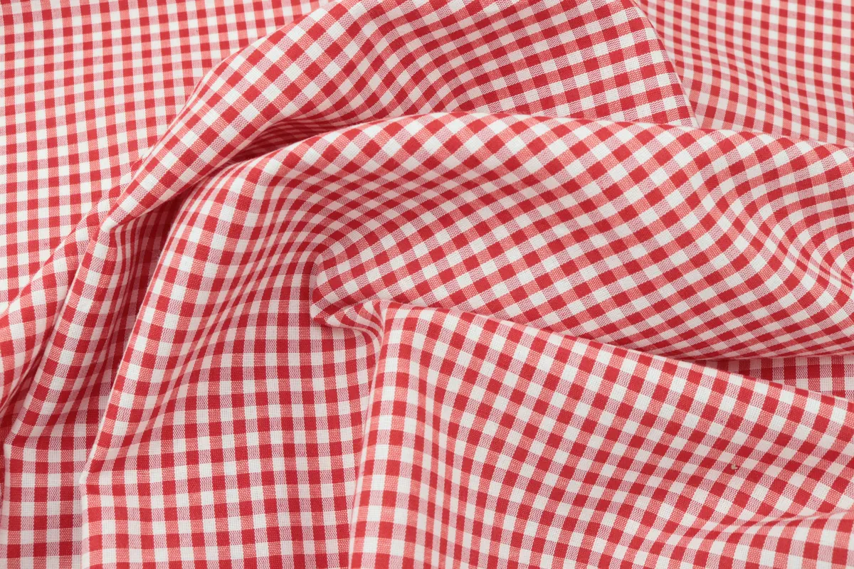
It's the sort of pattern you might associate with picnic blankets, kitchen curtains or a childhood tablecloth. But here, in this ordinary apartment, it doesn't feel particularly nostalgic. It feels graphic. Familiar, but slightly unexpected.
That is one of the most interesting ideas in the pattern forecasts for 2027. The question is no longer whether a room should have patterns. It's how the patterns we already know can live differently.
The pattern that refuses to stay in the country
On November 1, 2026, Homes & Gardens published a look at five pattern directions designers expect to influence interiors in 2027. Gingham is one of them.
But the designers interviewed aren't suggesting a return to an entirely rustic interior.
Louisa Tratalos, founder of Colours of Arley, points toward unfamiliar color combinations and new contexts. She even proposes using gingham as a sheer at the window.
Interior designer Michelle Gage favors pairing it with florals, allowing one familiar pattern to talk to another. Her description of gingham as "a timeless pattern" is particularly useful.
A familiar design doesn't become interesting because it suddenly appears in a trend report. It becomes interesting when we stop assuming it has only one possible setting.
Start with one square
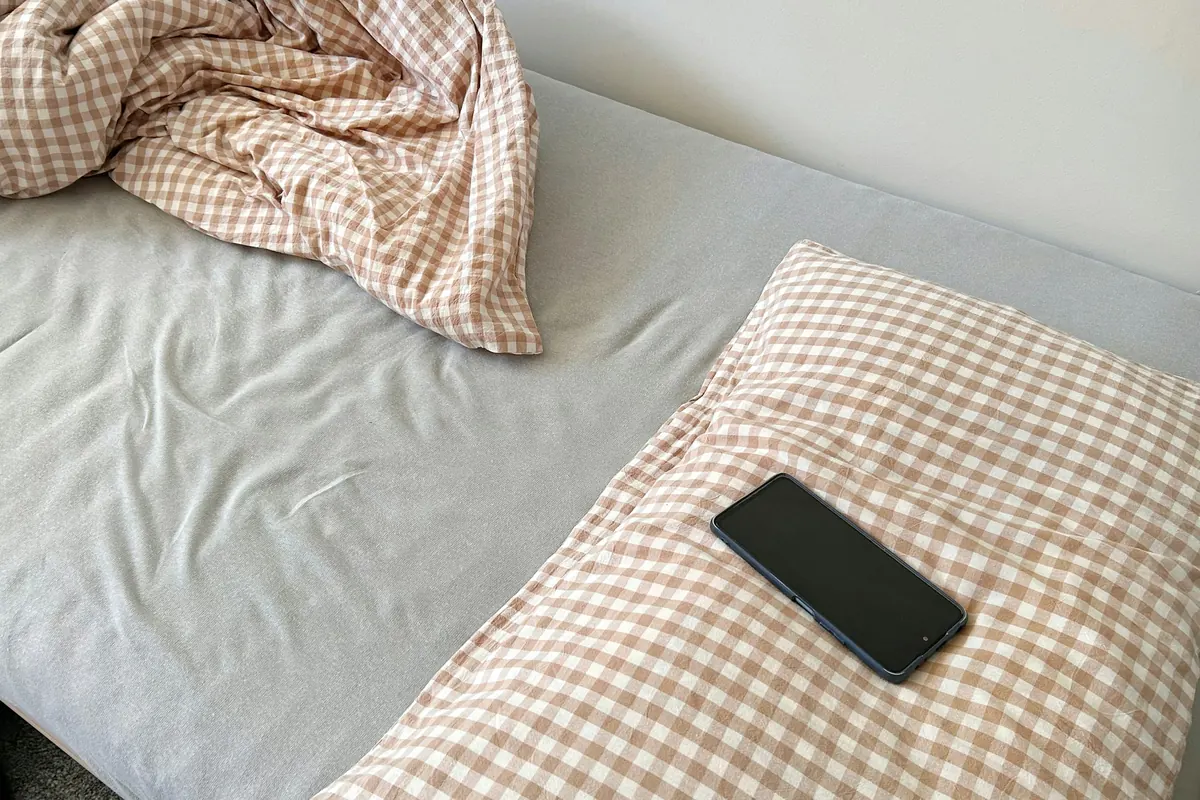
Imagine a room with plain curtains, a simple sofa and a wooden table. You add one gingham cushion. That's all.
The room doesn't have to become a cottage. You don't need a basket of dried flowers, matching curtains or an entire checked table setting.
Instead, look at the relationship between the pattern and what is already there. Perhaps the gingham feels more modern beside an uncomplicated piece of furniture. Maybe it becomes playful next to a floral textile.
You could try the same experiment with a checked napkin, an old kitchen cloth or a piece of fabric you kept from another project. Place it somewhere unexpected. Live with it for an afternoon.
The aim isn't to create a convincing trend photograph. It's to discover whether you enjoy that little interruption in the room.
The quieter patterns of 2027
Gingham isn't the only familiar print receiving renewed attention.
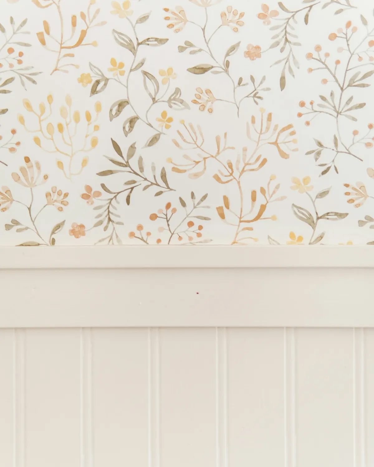
Designer Tamsyn Mason sees a move toward smaller-scale motifs, particularly on wallpaper, where their details reveal themselves gradually. Her suggestion: balance them with bolder, more colorful cushions.
There's a useful lesson here, even if you have no intention of changing your walls. Pattern isn't only about the design itself. Scale matters.
A tiny repeated print beside a large floral. A narrow stripe next to a checked fabric. A patterned book cover resting against a plain background. These arrangements create variation without requiring every object to shout for attention.
Sometimes the print you notice last is the one that makes a room worth looking at again.
Flowers that belong to the present
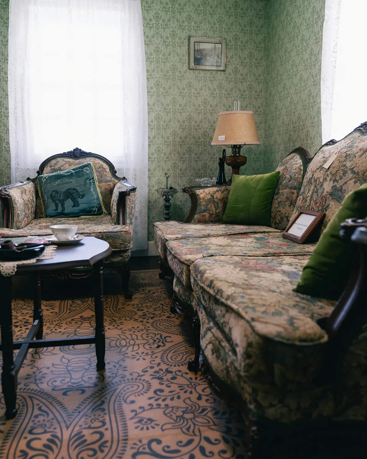
The third direction is traditional florals. Emily Ruff of Cohesively Curated expects familiar flowers, especially hollyhocks and roses, to return.
Her approach isn't to fill every surface with matching flowers. She recommends varying their scale and balancing them with plain fabrics, stripes, checks and different textures.
Imagine an older floral sofa in a contemporary living room. It doesn't need floral curtains and a matching rug. A plain linen cushion might give the upholstery some breathing room. A striped textile can introduce another rhythm.
The floral becomes one part of the story rather than the entire theme. This is how a pattern can feel collected, not staged.
What about murals and chintz?
There are two more directions in the forecast.
The first is whimsical, nature-inspired murals. Chloe Vince of House of Hackney suggests adding a stripe beside a mural to bring it up to date. You don't need a mural to understand the principle: a botanical print beside a striped cushion starts a similar conversation on a much smaller scale.
The second is chintz. Jools Cornell of Pukka Print favors a more restrained approach than the heavily coordinated rooms of the 1980s: one upholstered piece, a curtain or a single statement piece, with unexpected colors, plain linen or stripes.
Five trends, then, but one recurring idea. Pattern feels more personal when it doesn't have to match everything around it.
Five questions, three possible personalities. Choose the answer you'd actually enjoy living with, not the one that looks most impressive in a photograph.
The room doesn't need another personality
A pattern can be beautiful and still be wrong for your home. Perhaps you already have a striped chair, a floral cushion or a checked cloth that means something to you. Instead of buying another print, try changing their relationships.
If the combination doesn't work, you can undo it in seconds. That's the pleasure of experimenting with cushions, books and fabric instead of treating every new idea as a renovation.
A beautiful room doesn't need every pattern to agree. It needs them to belong to the same life.
Beyond the forecast
By late afternoon, the rain has stopped. The checked tea towel is back in the kitchen. The chair is still beside the table.
You haven't changed the wallpaper or ordered new curtains. But now you're noticing the pattern on an old cushion. The stripes of a folded blanket. The little flowers on a piece of fabric you nearly forgot.
Maybe 2027 will bring fresh combinations of gingham, florals and small motifs. That doesn't mean your home needs to start over. It means you have one more reason to look carefully at the things you've collected. If that idea appeals to you, discover how vintage pieces can live in a contemporary home without the museum look.
Because the most interesting pattern isn't always the newest one. Sometimes it's the familiar one you finally see differently.
Sources & notes
- Source: Homes & Gardens, "These Are the Pattern Trends Designers Are Expecting to Lead the Way in 2027" (November 1, 2026): gingham, small-scale motifs, traditional florals, whimsical murals and chintz.
- Designers cited there: Louisa Tratalos (Colours of Arley), Michelle Gage, Tamsyn Mason (Tamsyn Mason Interior Design), Emily Ruff (Cohesively Curated), Chloe Vince (House of Hackney) and Jools Cornell (Pukka Print).
- These are expert predictions for 2027, not sales figures. No search volumes, percentages or prices are claimed. The opening scene and the quiz are original editorial content.
- Photos (Unsplash License): Divazus Fabric Store, Ari Sha, Taylor Friehl, Erik Mclean.
11:07Una mañana lluviosa de domingo
El café ya está preparado. Hay una silla separada de la mesa del comedor y un paño de cocina a cuadros sobre su respaldo.
Nada extraordinario. Salvo que, por alguna razón, ese pequeño dibujo de cuadrados resulta interesante junto a la silla moderna, las paredes lisas y los libros apilados cerca.
Es el tipo de estampado que podrías relacionar con manteles de picnic, cortinas de cocina o recuerdos de la infancia. Pero aquí, en este apartamento, no se siente especialmente antiguo. Tiene algo gráfico. Familiar, pero también inesperado.
Esa es una de las ideas más interesantes de las previsiones de estampados para 2027. La pregunta ya no es si una habitación necesita estampados. Es cómo los estampados conocidos pueden encontrar nuevas formas de convivir.
El vichy sale de la casa de campo
El 1 de noviembre de 2026, Homes & Gardens publicó un análisis de cinco tendencias de estampados que varias especialistas esperan ver en interiores durante 2027. Una de ellas es el vichy, también conocido como gingham.
Pero las profesionales entrevistadas no proponen recrear una casa rústica.
Louisa Tratalos, fundadora de Colours of Arley, habla de reinterpretar diseños conocidos con colores inesperados y en otros contextos. Incluso sugiere usar vichy en un visillo para la ventana.
La diseñadora Michelle Gage propone combinarlo con motivos florales, dejando que dos estampados familiares dialoguen entre sí. Para Gage, el vichy es "a timeless pattern", un estampado atemporal.
Un diseño conocido no se vuelve interesante solo porque aparece en un informe de tendencias. Se vuelve interesante cuando dejamos de pensar que solo puede usarse de una manera.
Empieza por un solo cuadro
Imagina una sala con cortinas lisas, un sofá sencillo y una mesa de madera. Colocas un cojín vichy. Nada más.
La habitación no necesita convertirse en una casa de campo. No hacen falta cestas con flores secas, cortinas a juego ni una mesa completamente cubierta de cuadros.
En cambio, observa cómo se relaciona el estampado con los muebles que ya tienes. Quizá se vea diferente junto a una pieza contemporánea. Tal vez aporte un toque divertido al lado de una tela floral.
Puedes probar el mismo ejercicio con una servilleta a cuadros, un paño de cocina o un retazo guardado de otro proyecto. Colócalo en un lugar inesperado. Déjalo allí durante una tarde.
La idea no es conseguir la fotografía perfecta de una tendencia. Es descubrir si disfrutas ese pequeño contraste dentro de tu casa.
Los estampados que se descubren lentamente
El vichy no es el único dibujo tradicional que vuelve a llamar la atención.
La diseñadora Tamsyn Mason señala un cambio hacia los motivos de escala pequeña, sobre todo en papel tapiz, donde sus detalles se descubren poco a poco. Su propuesta: equilibrarlos con cojines de colores más intensos.
Hay una enseñanza útil detrás de esa idea, incluso si no piensas cambiar las paredes. No importa solo qué dibujo eliges. También importa su escala.
Un motivo diminuto junto a flores grandes. Una raya fina al lado de un tejido a cuadros. La cubierta estampada de un libro contra una superficie lisa. Estas combinaciones crean variedad sin obligar a todos los objetos a competir por la atención.
A veces, el estampado que descubres al final es el que más ganas te da de volver a mirar.
Flores que también pertenecen al presente
La tercera dirección es el regreso de los florales tradicionales. Emily Ruff, de Cohesively Curated, espera que vuelvan motivos clásicos, sobre todo las malvas reales y las rosas.
Su propuesta no consiste en cubrir la habitación con flores que combinen exactamente. Recomienda variar la escala y equilibrar los florales con telas lisas, rayas, cuadros y distintas texturas.
Imagina un sofá floral antiguo dentro de una sala contemporánea. No necesita cortinas floreadas ni una alfombra con el mismo dibujo. Un cojín de lino liso puede darle aire. Un tejido de rayas introduce otro ritmo.
Las flores pasan a ser una parte de la historia, no el tema completo de la habitación. Así, un estampado se siente reunido con el tiempo, no escenográfico.
¿Y los murales y el chintz?
El informe incluye otras dos tendencias.
La primera son los murales de fantasía inspirados en la naturaleza. Chloe Vince, de House of Hackney, propone sumar una raya junto al mural para darle un aire actual. No necesitas un mural para explorar esa idea: una ilustración botánica y un cojín de rayas inician una conversación parecida a una escala mucho menor.
La segunda es el regreso del chintz. Jools Cornell, de Pukka Print, propone usarlo con más moderación que en los espacios tan coordinados de los años ochenta: una pieza tapizada, una cortina o un solo objeto protagonista, con colores inesperados, lino liso o rayas.
Cinco tendencias diferentes, pero una misma idea. Los estampados resultan más personales cuando no les exigimos combinar con absolutamente todo.
Cinco preguntas, tres perfiles posibles. Elige la respuesta que de verdad disfrutarías en tu casa, no la que parezca más impresionante en una fotografía.
Tu casa no necesita otra personalidad
Un estampado puede ser precioso y, aun así, no tener sentido en tu casa. Quizá ya tienes una silla de rayas, un cojín floral o un mantel a cuadros que significa algo para ti. Antes de comprar otra tela, prueba cambiar la relación entre esos objetos.
Si la combinación no funciona, puedes deshacerla en segundos. Esa es la ventaja de experimentar con cojines, libros y telas en lugar de convertir cada idea en una reforma.
Una habitación bonita no necesita que todos los estampados estén de acuerdo. Necesita que formen parte de una misma vida.
Más allá de las tendencias
Al final de la tarde, la lluvia se detuvo. El paño de cuadros volvió a la cocina. La silla sigue junto a la mesa.
No cambiaste el papel tapiz ni encargaste cortinas nuevas. Pero ahora empiezas a notar el dibujo de un cojín antiguo. Las rayas de una manta doblada. Las pequeñas flores de una tela que casi habías olvidado.
Tal vez 2027 traiga combinaciones distintas de vichy, florales y motivos delicados. Eso no significa que tu casa tenga que empezar de cero. Significa que tienes otra razón para mirar con atención las cosas que has reunido con el tiempo. Si te gusta esa idea, descubre cómo combinar piezas vintage con muebles actuales sin convertir tu casa en un museo.
Porque el estampado más interesante no siempre es el más nuevo. A veces es ese que conoces desde hace años y que, por fin, aprendes a mirar de otra manera.
Fuentes y notas
- Fuente: Homes & Gardens, "These Are the Pattern Trends Designers Are Expecting to Lead the Way in 2027" (1 de noviembre de 2026): vichy, motivos pequeños, florales tradicionales, murales de fantasía y chintz.
- Especialistas citadas allí: Louisa Tratalos (Colours of Arley), Michelle Gage, Tamsyn Mason (Tamsyn Mason Interior Design), Emily Ruff (Cohesively Curated), Chloe Vince (House of Hackney) y Jools Cornell (Pukka Print).
- Son previsiones de especialistas para 2027, no cifras de ventas. No se presentan volúmenes de búsqueda, porcentajes ni precios. La escena inicial y el quiz son contenido editorial original.
- Fotos (licencia de Unsplash): Divazus Fabric Store, Ari Sha, Taylor Friehl, Erik Mclean.